Planned
Parenthood
About
Rethinking brand expression to reflect
authenticity and support in a time of
uncertainty and unrest.
Rethinking brand expression to reflect
authenticity and support in a time of
uncertainty and unrest.
Keywords
Grassroots | Empowered
Uprise | Connect | Contemporary
Strategy
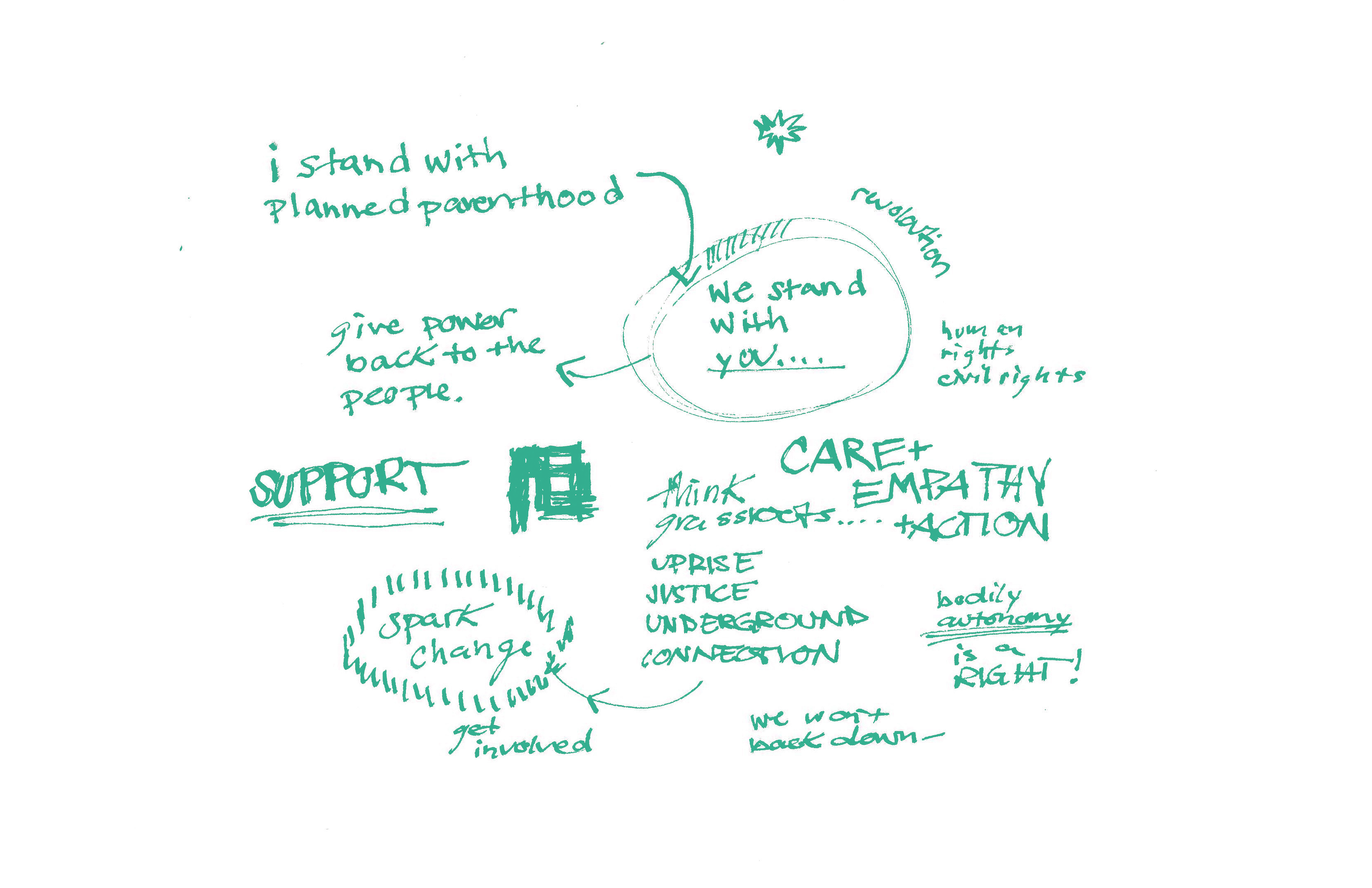
Shifting the voice of support back
towards the people they serve.
Shifting the voice of support back
towards the people they serve.
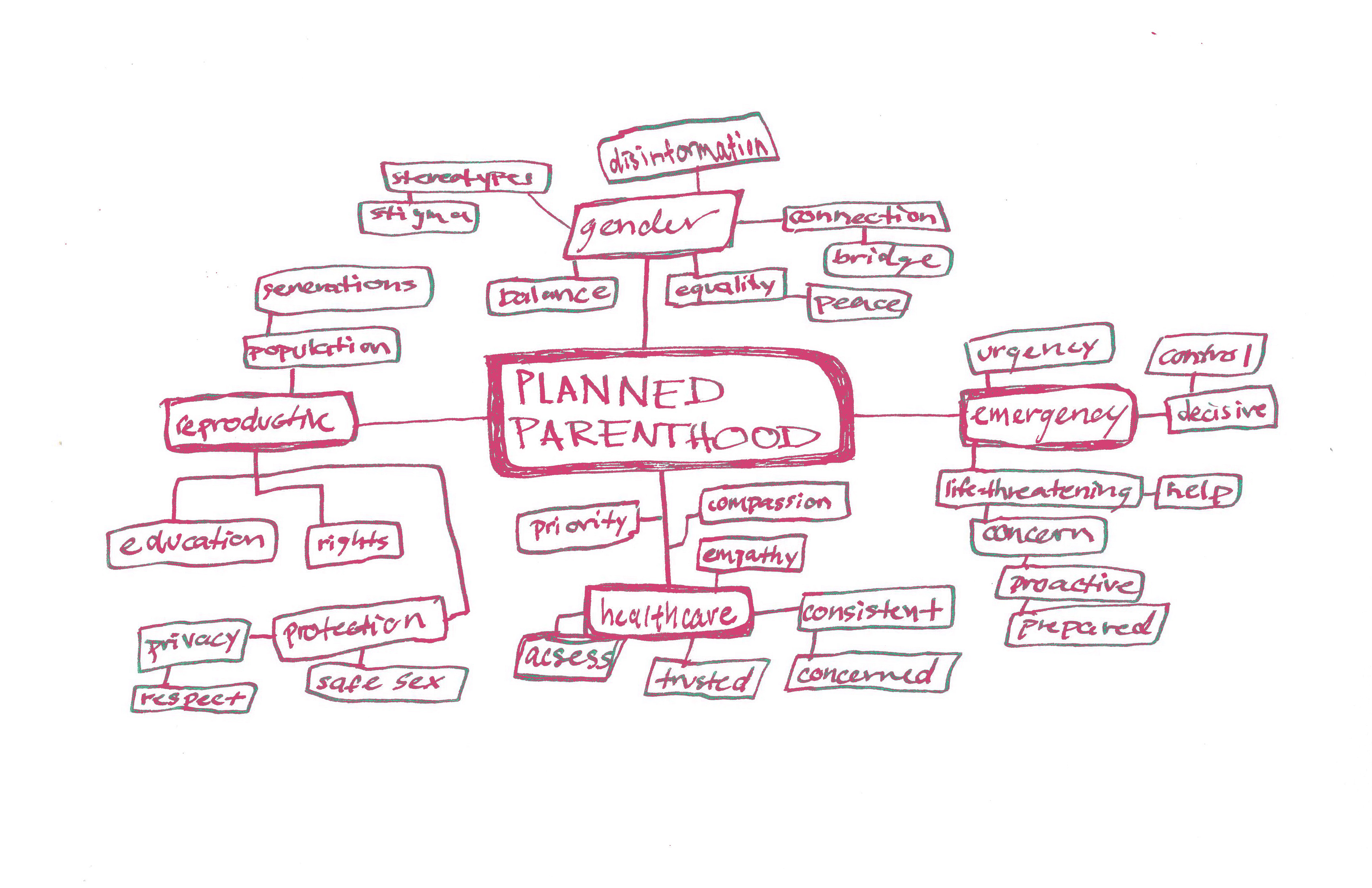
was focused on shifting the voice of support back
towards the people they serve, rather than on
themselves as a multi-million dollar organization.
As a non-profit, their brand strategy should more
accurately reflect the people and communities they
are committed to, especially now more than ever.




Brand Goals
2022 will be remembered by many as
the year the Supreme Court overturned
Roe. v. Wade, the landmark piece of
legislation that made access to an
abortion a federal right in the United States.
Safe and quality care is our main
priority and we will never back down
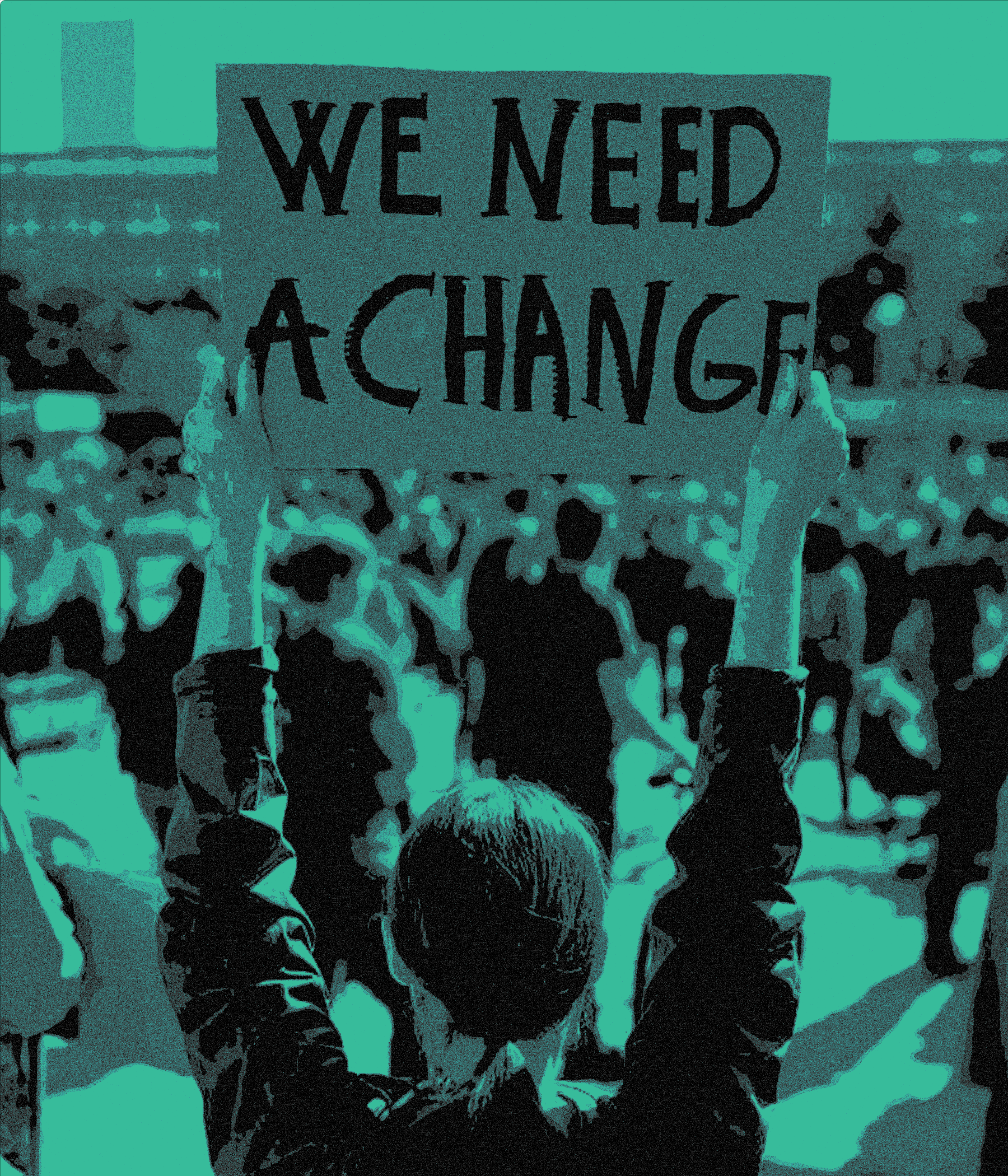
from that. We were inspired by the
courageous outcry from the public
to keep abortion legal and safe for all.
Our rebrand started with this
inspiration and we dove deep
into historical accounts of political
unrest and upheaval to reach a
campaign as brave and bold as you.


Symbol Development
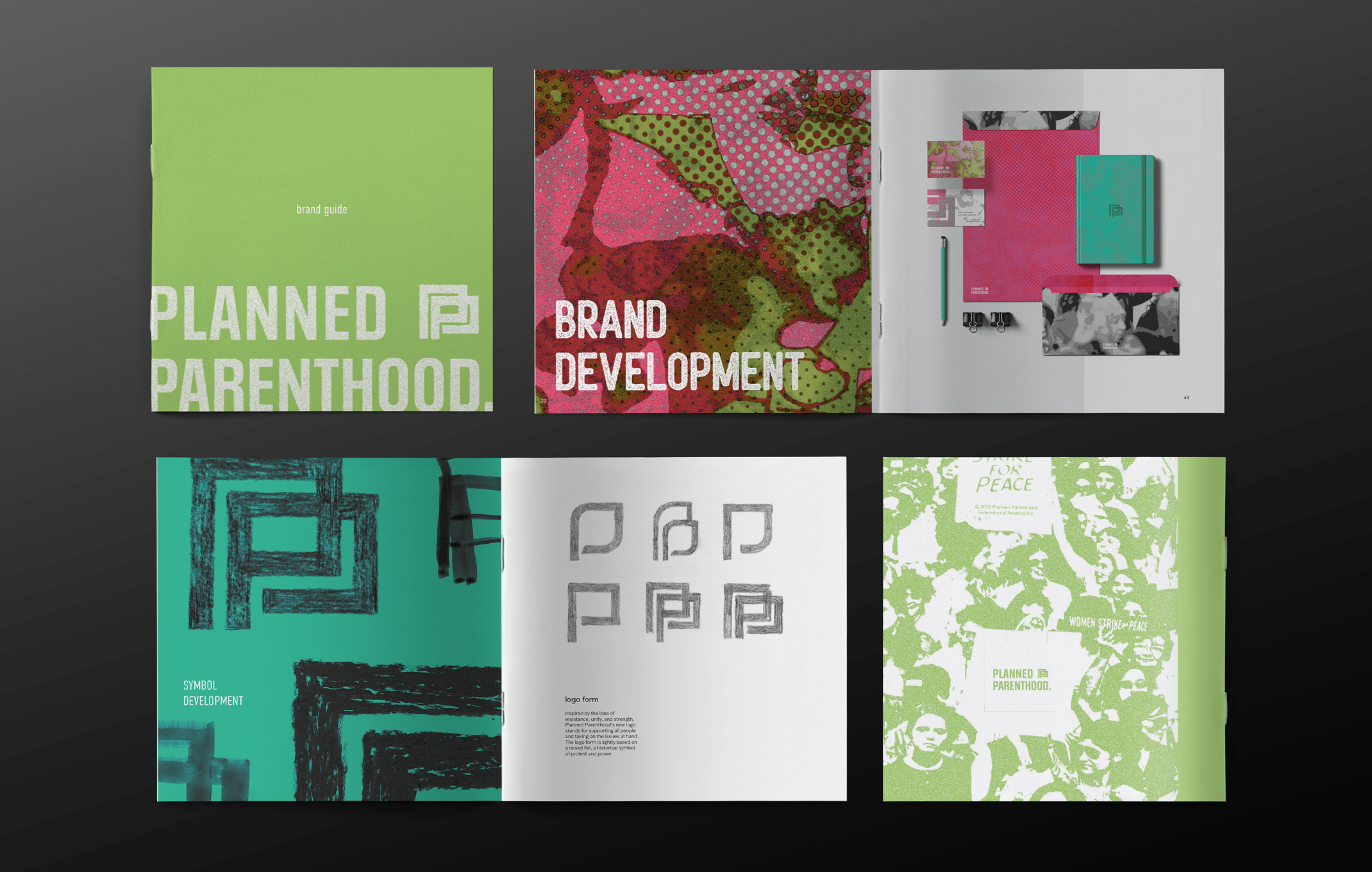
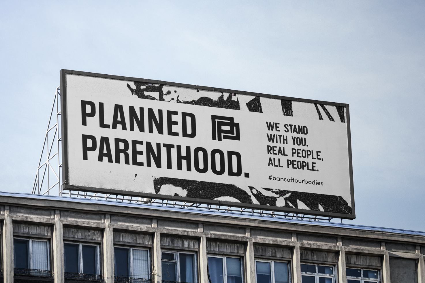
Inspired by the idea of
resistance, unity, and strength,
Planned Parenthood’s new logo
stands for supporting all people
and taking on the issues at hand.
The logo form is lightly based
on a raised fist, a historical symbol
of protest and power.


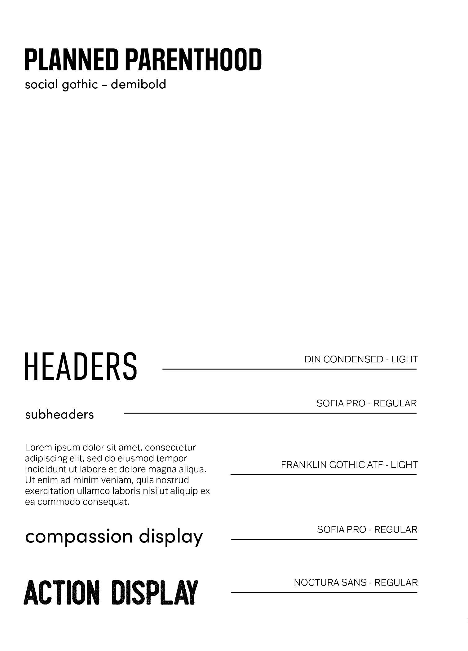
Type + Color
Solutions
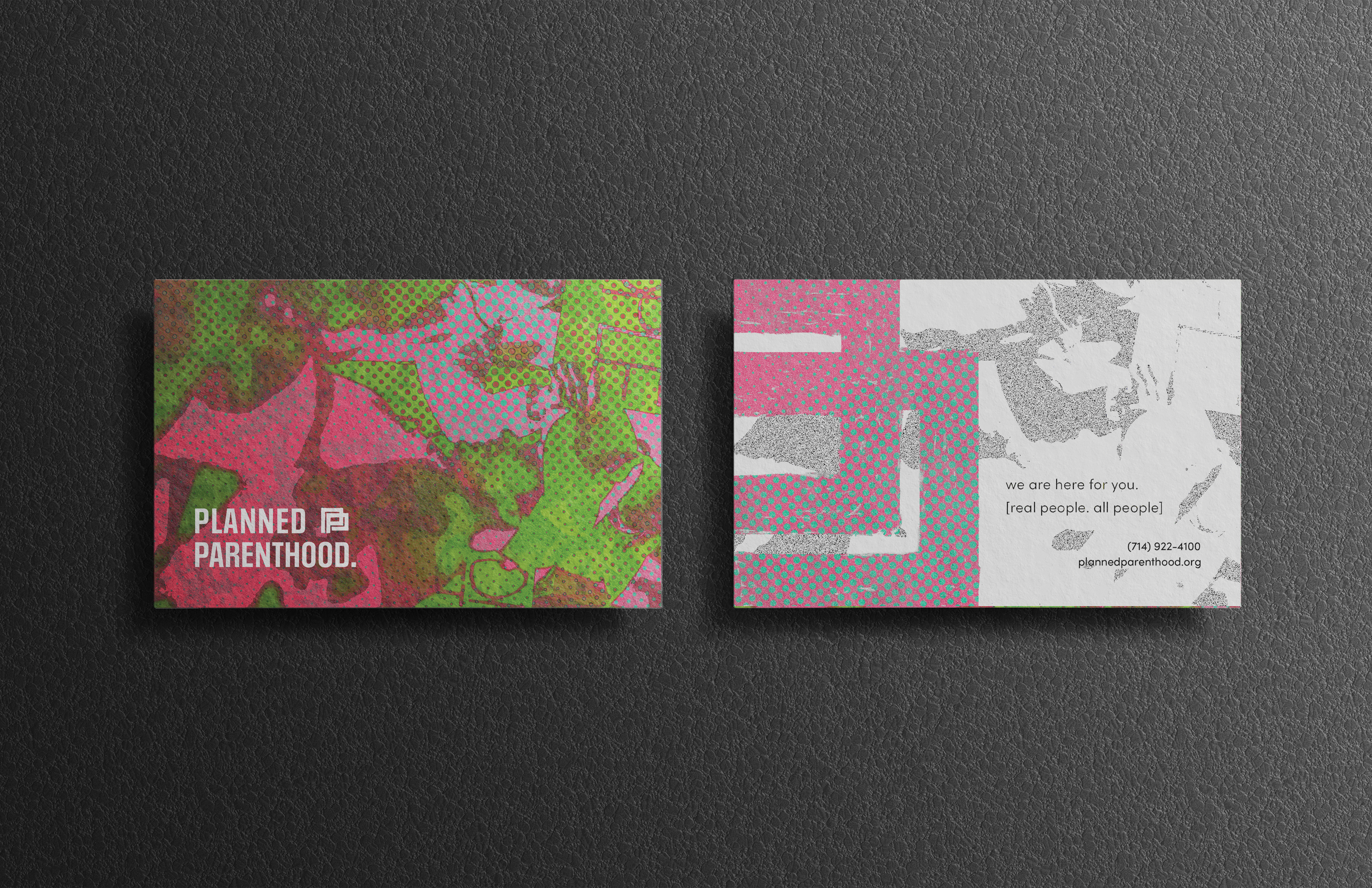
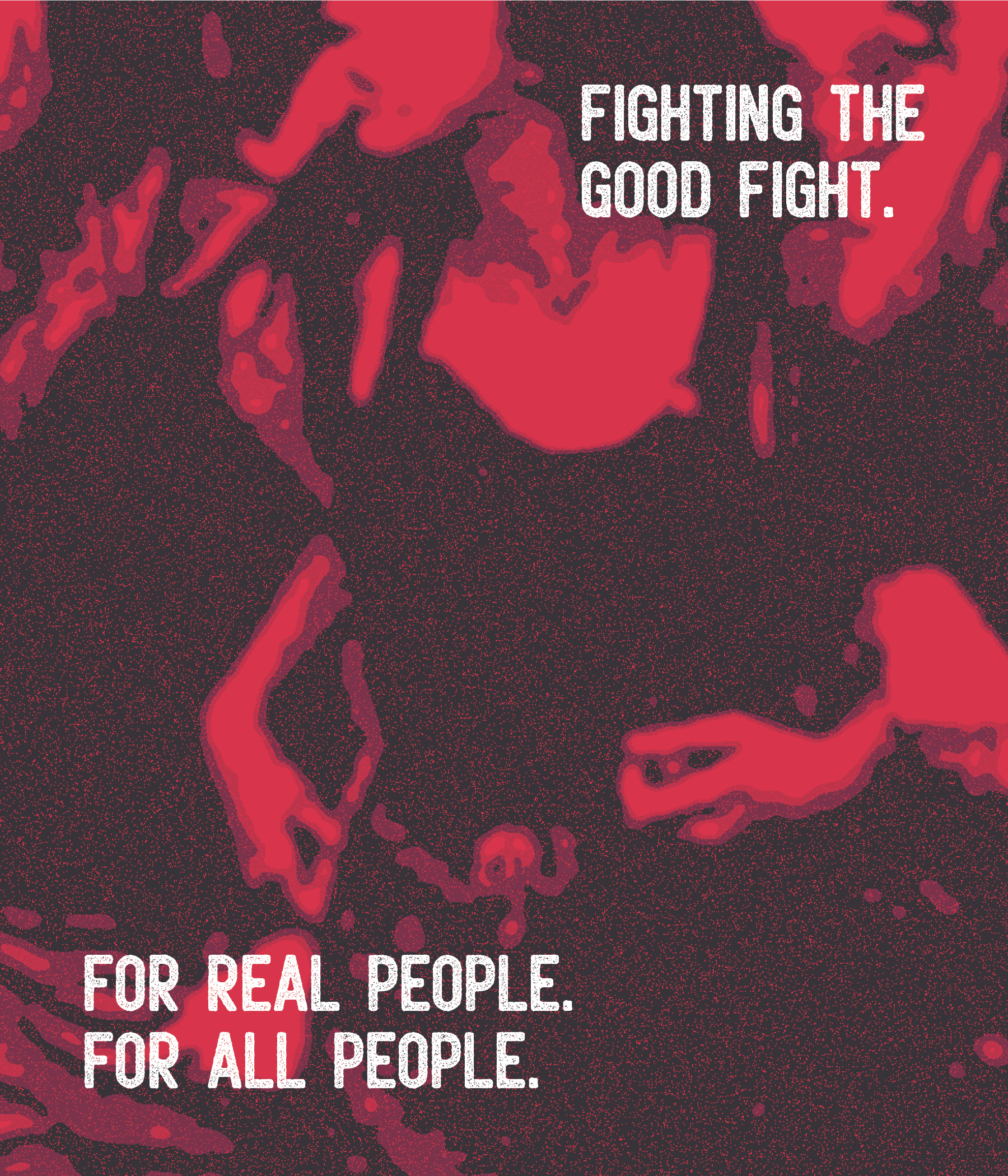
Texture in the context of
our typography and logo
was highly influenced by
handmade protest signage
and the use of poster paint.

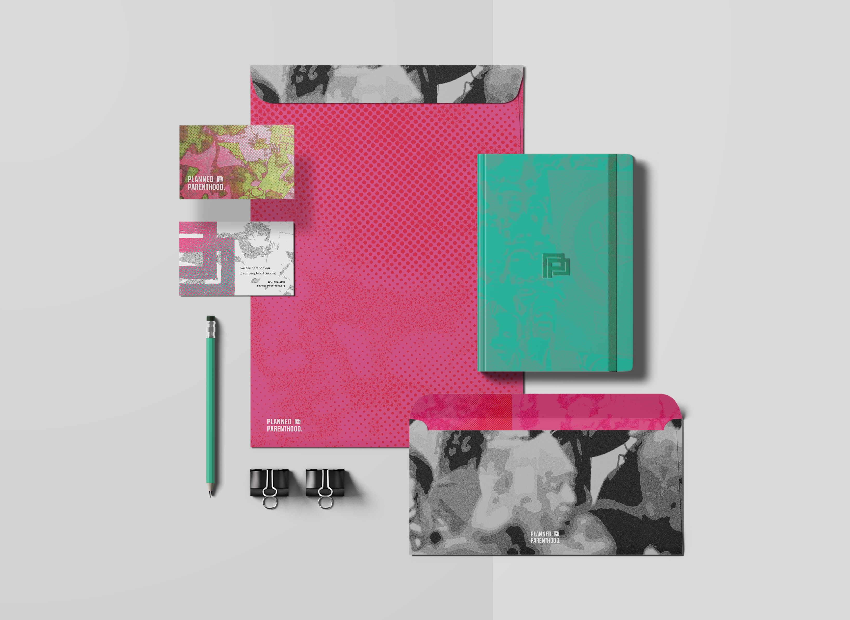
1. Our primary
pink is now more
vibrant and rich
to
reflect a timeless tone.
2. Our secondary green elevates our healthcare focused messaging.
2. Our secondary green elevates our healthcare focused messaging.
3. Our deep navy and a
vintage-inspired red
was added to our palette
as tertiary colors for
boldness and grit.


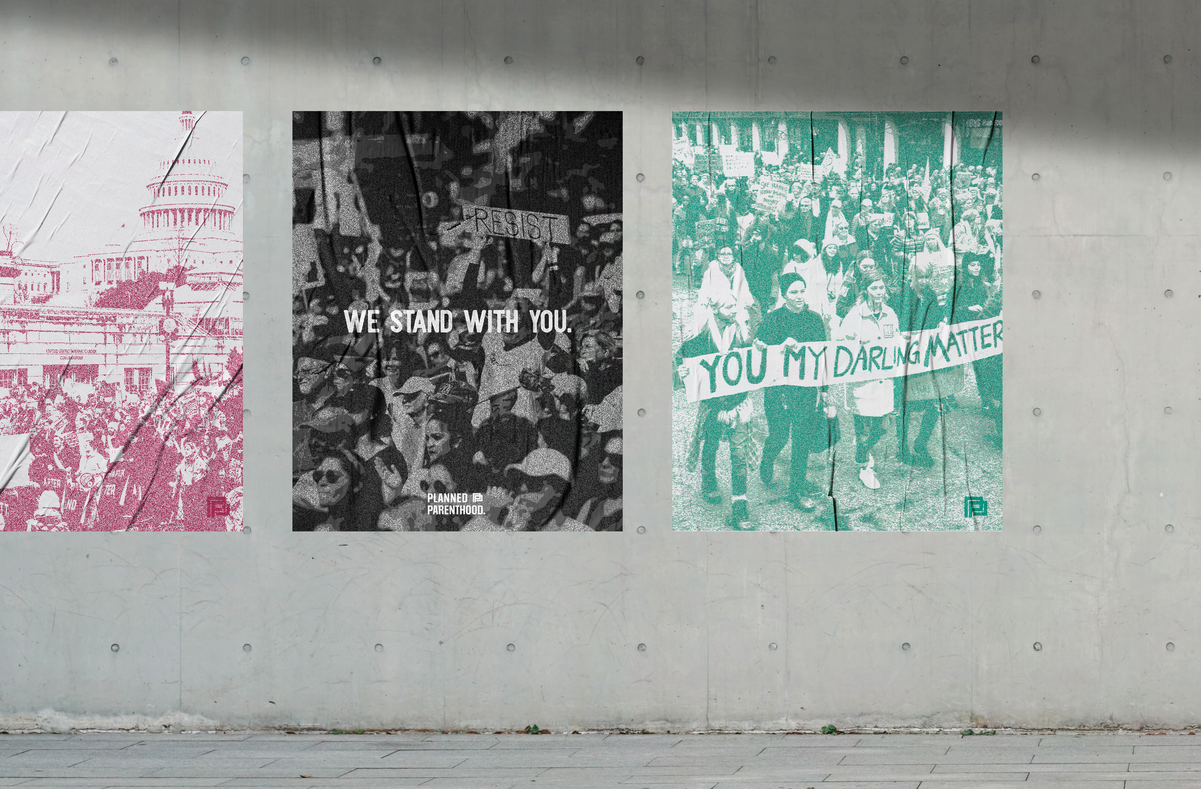



Packaging +
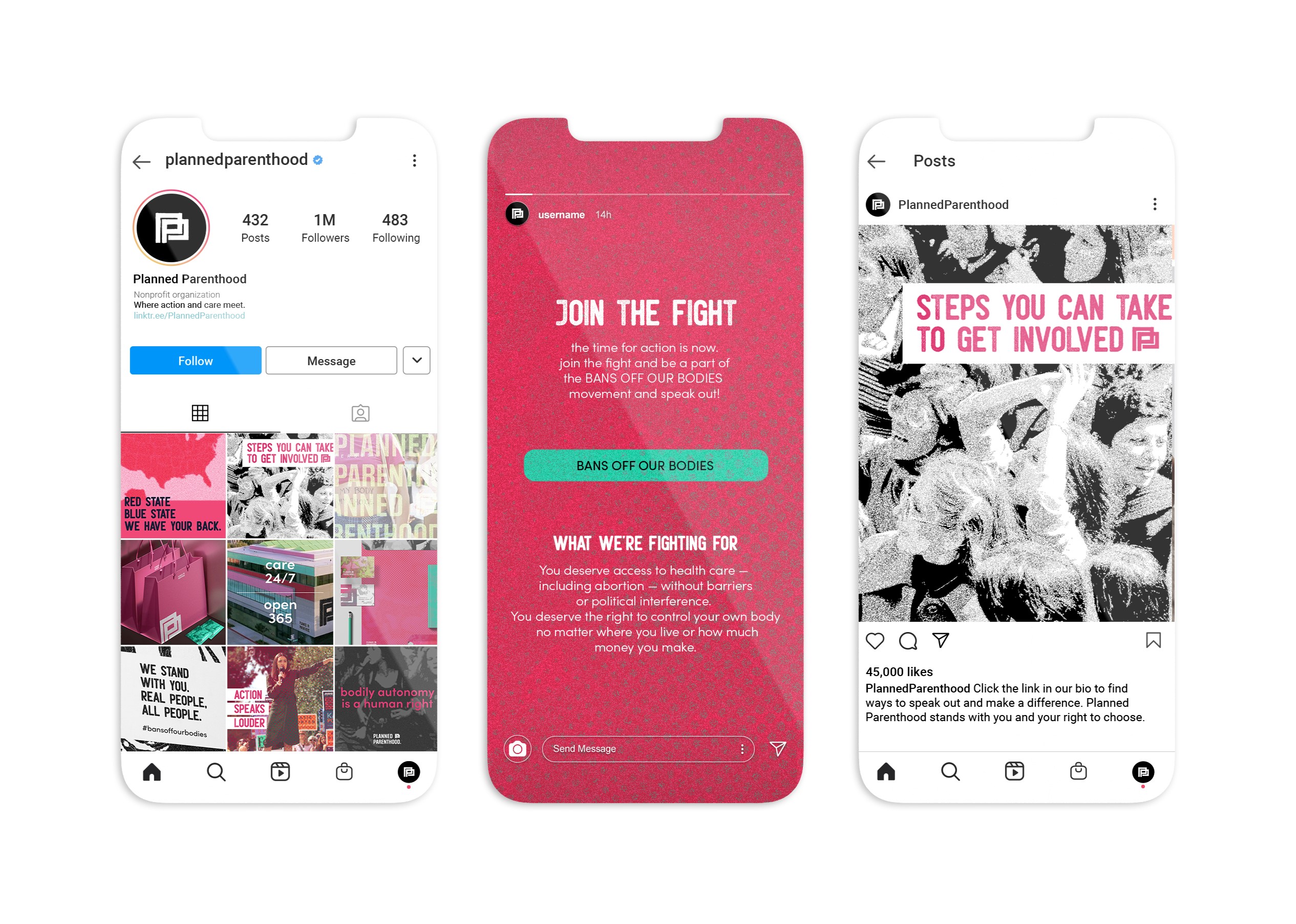
Social Content
